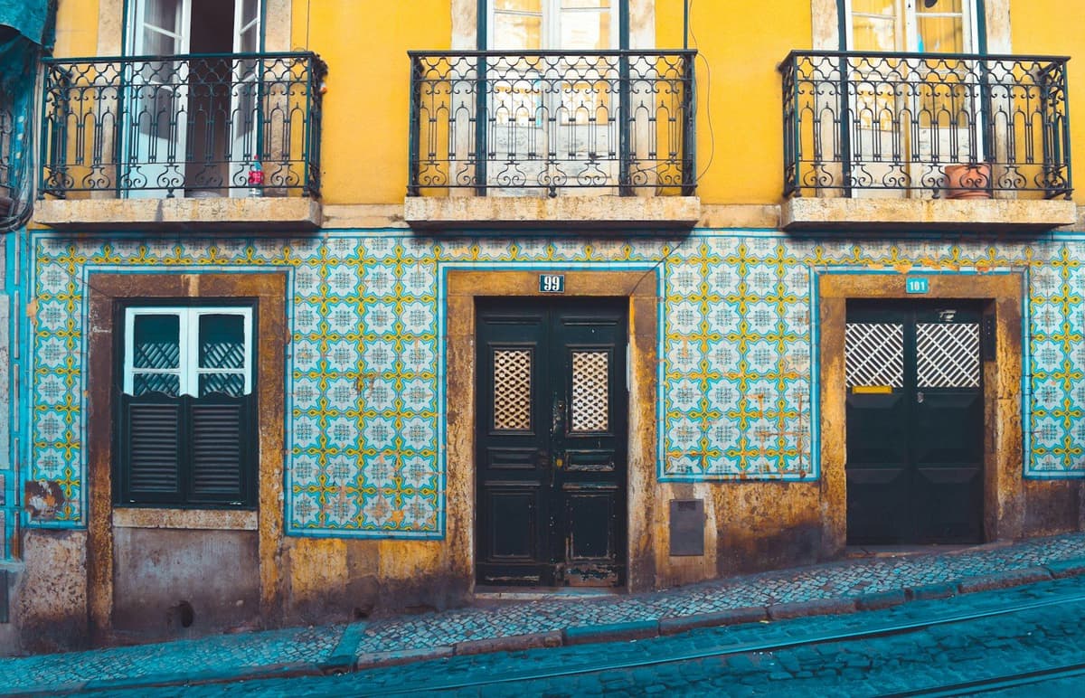
Choosing a paint colour for an apartment should be simple: one likes the shade, buys the paint, paints the wall. In practice, most homeowners discover, too late, that the soft beige on the colour chart becomes yellow at sunset, or that the elegant grey from the sample transforms into blue at noon. The difference between imagining a colour and seeing it applied, under real light, on real walls, is striking.
The good news is that this mistake is avoidable. Testing paint samples before the final decision remains the cheapest and most overlooked step of a successful paint job in Portugal.
Portuguese natural light changes everything (and the colour chart doesn't warn)
Light tones such as white, beige, sand or soft grey help reflect natural light better and create a sense of space1, but that same natural light varies dramatically throughout the day. An apartment in Lisbon with south-facing windows receives warm, intense light that brings out yellow and orange tones. In Porto, where light tends to be more diffuse and grey for much of the year, the same colour can appear cool or even greenish.
Colour charts show shades under controlled, almost always artificial lighting. When that same paint is applied to a wall exposed to morning sunlight, afternoon shadow or artificial light at the end of the day, the result changes. And it always changes in the opposite direction to expectation. Choosing is not enough. The colour must be seen working in the real space, under real conditions, before ordering 15 litres of paint and starting work.
How to test samples without turning the wall into a showroom
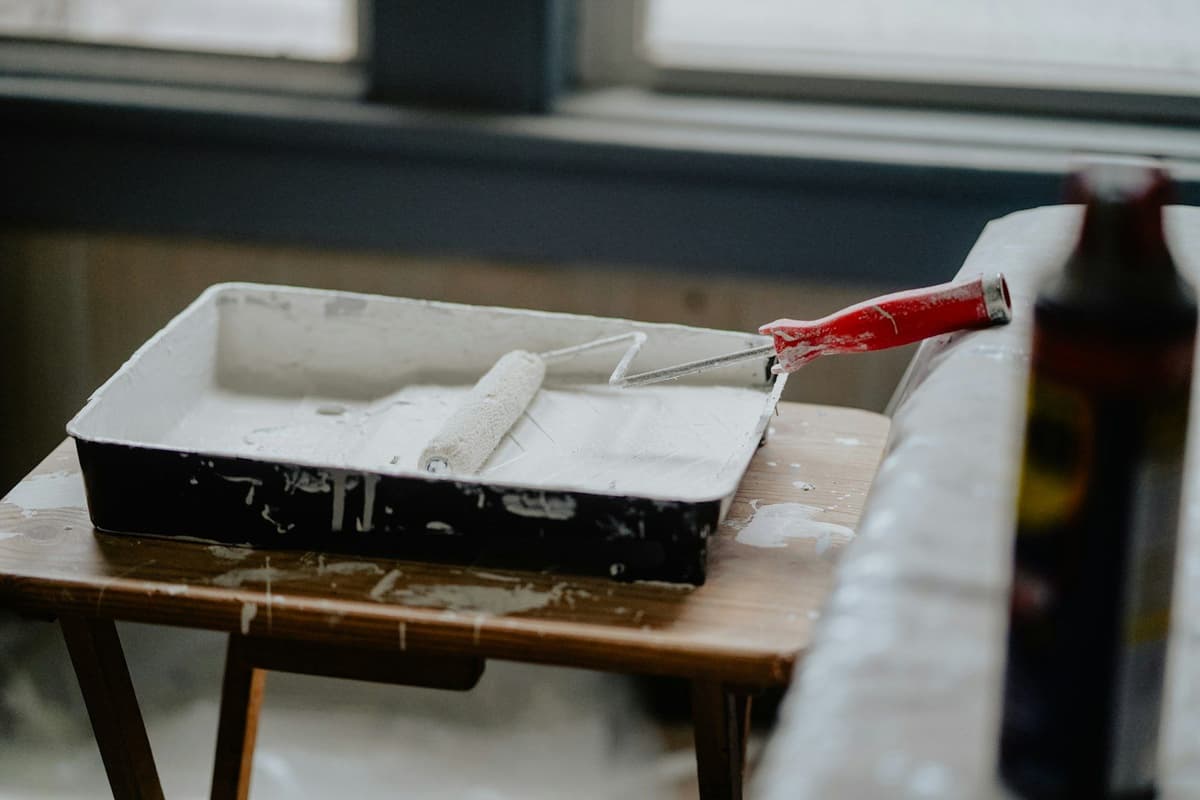
Testing does not mean painting the entire wall with five different colours and waiting a week. The most practical method involves buying small samples (many brands in Portugal already sell 100 ml or 250 ml test packs), applying squares of at least 50x50 cm in representative areas of the room and observing them over two or three complete days.
The squares should be on walls with different sun exposure: one facing the window, another in the shaded area, another next to an artificial light source. The idea is not to decorate, but to gather information. After 48 hours, the colour that seemed perfect in the morning may prove too intense at sunset, or too pale under ceiling light.
If the apartment is furnished, it is worth testing next to existing furniture. A grey sofa can pull beige towards pink, or an oak floor can warm a cool white to cream. Context matters as much as the paint.
Finishes change colour perception as much as the shade itself
The type of finish (matt, satin, wipeable) influences both application time and the technique required2, but above all it influences how colour is perceived. Matt finish helps disguise small defects and unwanted textures on surfaces, but it absorbs light, making the colour deeper and less luminous. A matt grey can appear almost lead-coloured in a room with little natural light.
Satin finish, on the other hand, reflects light subtly, making the same colour appear lighter and more dynamic throughout the day. The slightly silky appearance gives relief to walls while offering excellent ease of maintenance. In an apartment in Coimbra or Aveiro, where humidity can be an issue, wipeable satin makes more sense in kitchens and bathrooms, even if it means adjusting the chosen shade to compensate for the extra shine.
Ignoring the finish when testing samples is like choosing a fabric without thinking about texture. Colour always exists on a surface, and that surface changes everything.
What to do when the sample doesn't match expectations
When the tested colour disappoints, the temptation is to give up or choose white "to be safe". Neither option solves the problem. Generic white is rarely neutral: it can lean towards blue, cream or grey, depending on the light. And abandoning the desired colour without understanding why leaves the homeowner without guidance for the next attempt.
The most effective path involves adjusting the shade in the opposite direction to the problem identified. If the beige became too yellow at sunset, it is worth testing a cooler beige, with a grey or pink undertone. If the grey seemed too blue at noon, the solution may lie in a grey with a warm undertone, leaning towards beige.
Portuguese paint brands typically offer hundreds of shades within the same colour family. The difference between a failed choice and a successful one often lies just two or three references apart on the chart. But this is only discovered by testing.
The cost of not testing is redoing everything a week later
A sample pack costs between 5 and 10 euros. Testing three or four different tones represents an investment of 30 euros at most. Redoing an entire room because the chosen colour doesn't work easily costs 300 to 500 euros, between new paint, labour and lost time. The maths is clear, but it continues to be ignored by most homeowners painting apartments in Portugal.
True economy is not in saving 30 euros on samples. It lies in avoiding rework, frustration and the feeling of living in a room whose colour should never have been applied. Testing samples is not perfectionism. It is basic planning, as essential as preparing the surface before painting or choosing quality paint.
Before ordering the paint, confirm the colour in real conditions
On our platform, professionals always ask for photos and videos of surfaces before closing the quote, precisely to assess natural light, sun exposure and the space's context. That same logic applies to colour choice: what works in an apartment in Setúbal may fail in an apartment in Viseu, even if the layout is identical.
Testing samples before the final decision is the only moment when the homeowner still has full control over the result. Once the paint is on the wall, only two options remain: accept the mistake or redo everything. And neither is cheap.

Ready to paint?
Get free quotes from verified local painters in minutes. No commitment.
Sources
External sources open in a new tab.